A website design can make or break your chance of getting more online tour bookings. With a strong website, your customers can go through the booking process quickly and with ease. Everything on the website fulfills a need, it’s all easy to find, and navigable. While your customer browses your site, it should cause some sort of emotion in them and they should feel like they can trust you.
Further, your site should help customers along their path to book a trip with you. By clearly showing steps, making the interaction seamless and efficient, and having the system perform when customers are interacting with your site makes it more likely they’ll book a trip with you.

1. Keep Your Website Design Simple
In less than a second, your visitors will evaluate your website—whether it’s trustworthy, credible, simple, and what they’ll do next on it—so you need to decide what you want them to do and make it clear.
Design a simple user interface (UI)
We’ve previously written about the importance of a simple user interface which really just means how easy it is to get visitors from Point A to Point B without them having to work hard to do it.
The UI is clear
When your UI is clear, your buttons look and act like buttons should. The links, text, and images all work together, separately, and have a reason for being where they are. This is especially true for guiding professionals’ websites with booking buttons.
Automate Your Tasks
Tour operator life is complicated Use a booking platform that simplifies it.
Automate Your Tasks
Tour operator life is complicated Use a booking platform that simplifies it.
The visitor’s goal is in mind
When someone comes to your website, they have a goal in mind, like booking a trip with you. If you have too many clicks that don’t clearly lead to them booking with you, you’ve created a “goal gap.” The fewer steps it takes to book a trip with you (i.e. for your visitor to reach their goal), the smaller the “goal gap,” and the bigger chance of them actually reserving the trip.
Your site is stress-free
When tasks to get from Point A (homepage of your site) to Point B (booking confirmation page) are simple instead of demanding, visitors are more likely to engage with your site. The steps feel automatic instead of a struggle. This gives you customers more confidence because they feel like they have control.
Focus on the user experience
Visitors are likely to remember how they felt browsing your site over the data they read. So, it’s important to create a website that stands out from the janky ones. Think about how you’d want to interact with a website and what makes the sites you visit (and revisit) engaging and user-friendly.

2. Make Your Website Design Clear
Similar to keeping your site simple, you want to make sure you create a clear website structure too.
The Law of Pithiness
We’re not going to get too much into the weeds of psychology, but one principle is the Law of Pithiness, which is a fancy term that means we all prefer things that are clear and orderly. We like symmetry. We like simplicity. We shy away from complicated things because we assume they’re going to be terrible.
When your website is simple, clear, and predictable, visitors will feel more at ease on it. Knowing how to use a site means visitors will likely book their adventure on it too instead of going to a new site that makes them feel at ease.
Remove website design distractions
If something isn’t essential in getting your visitors to book a reservation with you, then remove it. This could be extraneous text, too many pictures, or something they don’t find valuable. Your adventure landing pages should be easy to navigate, clear, and concise.
Packages are easy to understand
You want your trip descriptions to be so clear that your visitors have no questions and are ready to book immediately. So, yes, you want to be descriptive and provide enough information so travelers can make an informed decision, but you don’t want to overload them with details too. It’s a fine line, but the bottom line is to make your packages or offerings easy to understand so customers don’t have to call you.

3. Make Your Website Easy To Book
Not only should your website design be simple and clear, it needs to be easy to book. If you have a simple homepage, but the booking process is janky, you’re not going to get a lot of bookings.
Make the first step super easy
Instead of asking your customers to fill out one thousand questions or to require them to know all their group’s email addresses and phone numbers, start with a few simple fields to get the process going. Origin users only have one screen and a few fields to complete in order to book a tour because we realize people want to move on as fast as possible.
By removing any unnecessary form fields, this can help improve your conversion rate (the number of people who end up booking a trip with you).
Make navigating your site straightforward
Visitors won’t just be accessing your site from their desktop. A lot will be navigating from their smartphone or tablet, which means simple navigation is crucial. The first thing to do is make sure your site is mobile-optimized. This means that when someone visits your site from their phone or tablet, it acts similar to desktop.
There are a lot of sites that are inherently mobile-friendly, but verify by accessing your site from your own device. If it isn’t, looking for a WordPress theme or website developer who can create a mobile-optimized site. Not only will this make your customers happy, but it’ll help you show up higher in Google results. Without a mobile-friendly site, Google will penalize you by dropping you in results.
Use embed codes for booking widgets
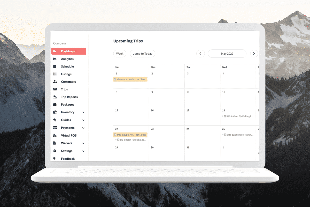
If you’re using an operating system like Origin, we provide you embed codes to paste on your website so you can take bookings on your own pages. Our widgets are developed to look and feel like it’s part of your site. This also removes several steps in the booking process, which makes reserving a trip that much easier.
Use an availability calendar
If you’re not using Origin’s widget, then you need a calendar that shows up-to-date trip availability. Visitors will either be in a trip-planning stage or booking stage and both will want to know real-time availability, whether that’s tomorrow or two months from now.
Remember that websites are scanned, not read
We may think what we have to say is important, and it is, but users nowadays scan for information and then read it if they want to learn more. Think about this when writing content for your website. Make your text scannable with most important information highlighted or enlarged.
Automate Your Tasks
Tour operator life is complicated Use a booking platform that simplifies it.
Automate Your Tasks
Tour operator life is complicated Use a booking platform that simplifies it.

4. Get More Online Bookings By Gaining Customers’ Trust
If visitors don’t trust you to fulfill your promise (offering an amazing adventure), then they won’t book with you. Part of gaining their trust is showing pictures or videos of people doing what they want to do, posting customer reviews, and having transparent pricing.
Add testimonials and reviews
Not many people want to be the first person to use a service, but they will trust others’ reviews. Help put your potential customers’ minds at ease by publishing reviews and testimonials from your clients on your website where a visitor can easily see them.
Publish high-resolution photos
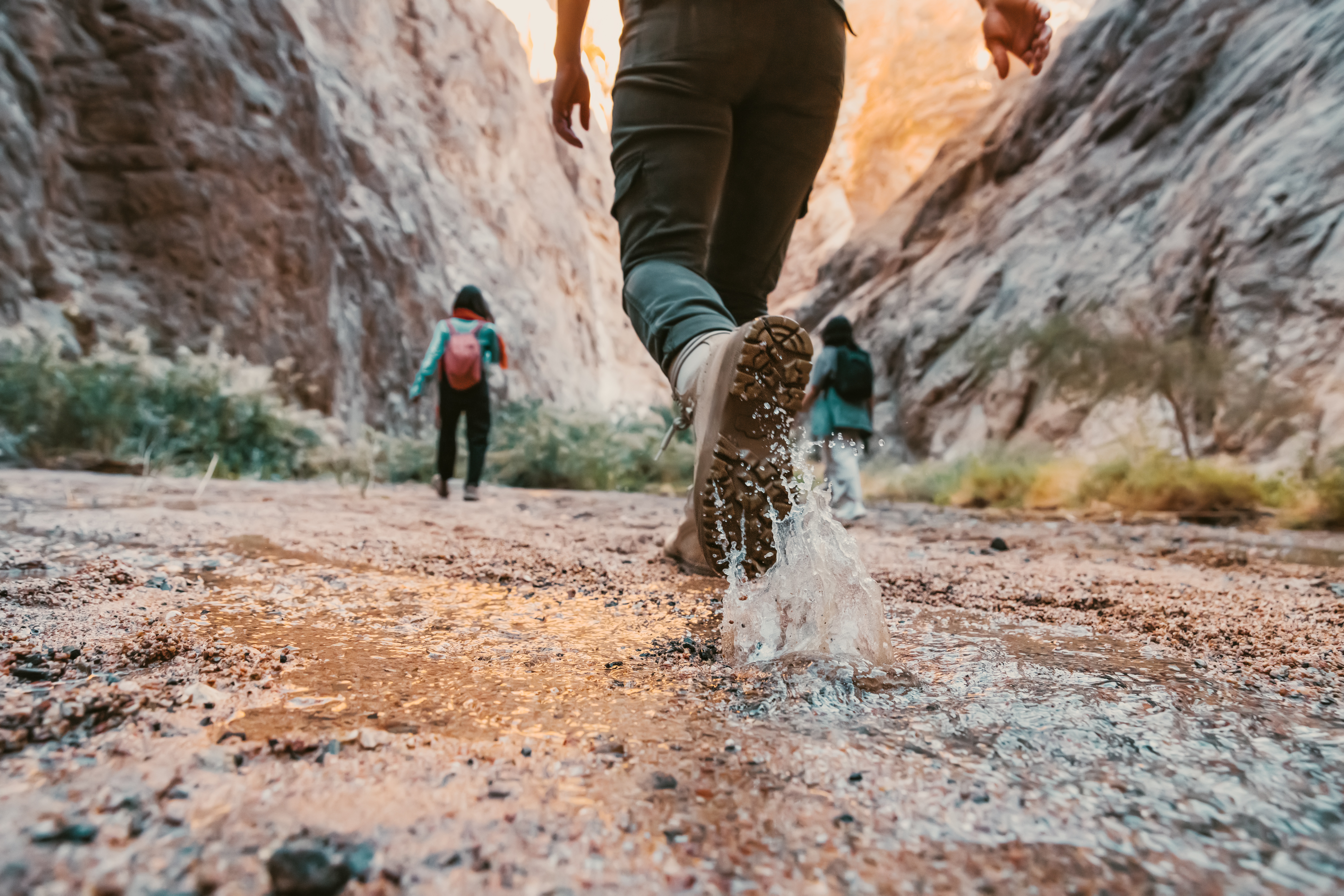
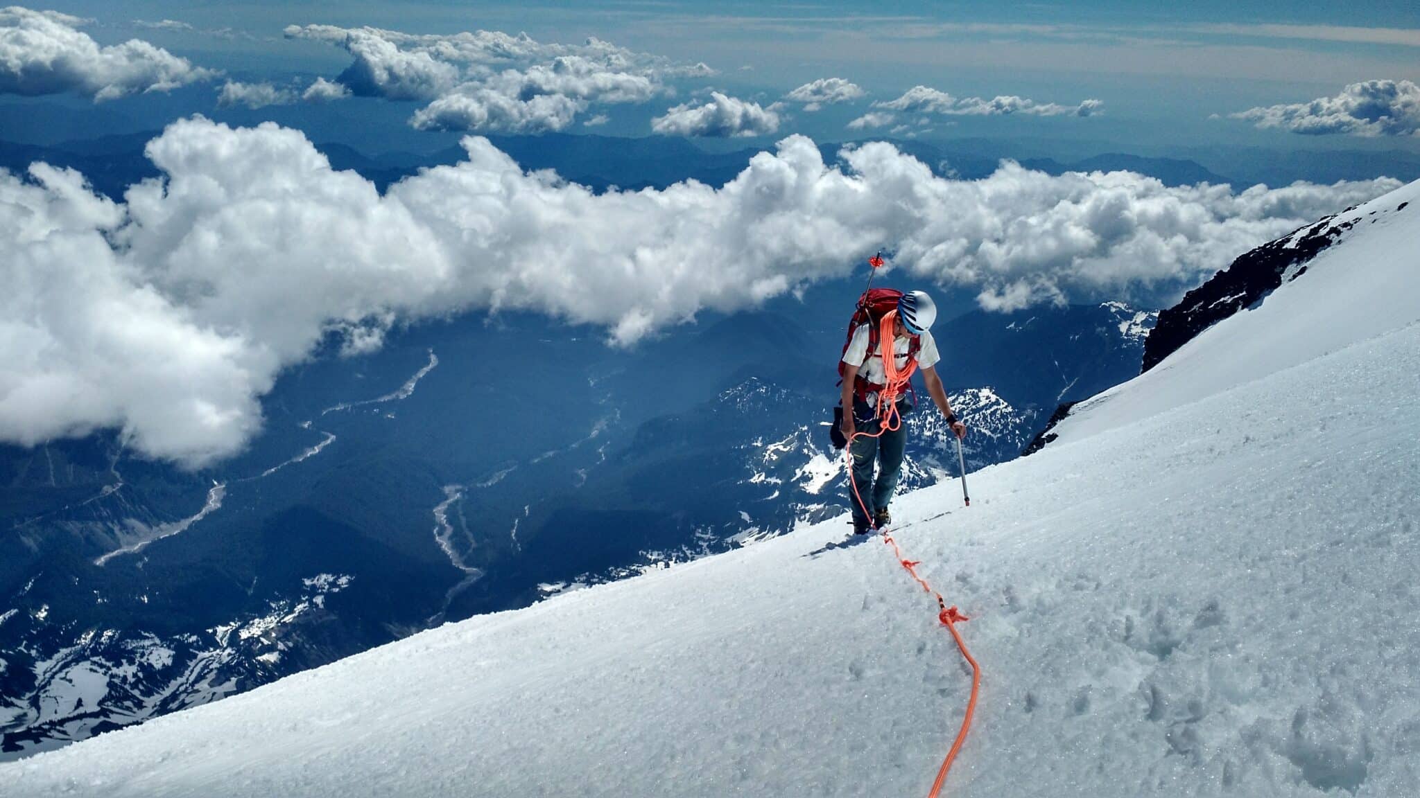
In addition to testimonials and reviews, using high quality images throughout your website will help you get more online bookings too. When people see your customers doing what they want to do they’ll experience it through the photo.
If you guide rock climbing, post high-res pictures and videos of your customers enjoying themselves. When potential customers browse your website, it’ll be easier for them to imagine doing it too. And it’s a great way to show them what they can expect on a tour with you.
Make it easy for customers to contact you
While you want to make sure your website design is self-explanatory, sometimes people still have questions that are best answered over the phone or email. In that case, have a clear “Contact Us” page and form on your website so customers can message you easily.
Set up an “About Us” page
Not every website visitor is going to click to your About Us page, but it’s a great way to let customers know more about you and your staff and explain your qualifications. Plus, you essentially put a face to the name of your business which develops trust too.

5. Make Your Website Fast To Get More Bookings
We’ve written about how your website probably needs a better online booking process and one of those reasons is because you may be doing a lot of things that slow the process down.
Have a powerful and reliable website
If your website is hosted on an unreliable server, it’ll run slow, and maybe even crash. You want to use a web host that can power your website, that rarely (if ever) has outages. If you continually run into memory issues or slow loading times with your web host, find a new one because it’s costing you business.
Build an amazing website
Website design is a skill and there are experts who can build you something that’ll do exactly what you and your customers want. You have to think of your website as a map or a path. Your job is to give visitors enough information to move from start to finish. They should feel excited, informed, and want to book a trip with you.
Perception is everything
The perception of your website design matters more than anything else. You want your customers to feel like your website is fast, easy, and user-friendly. You don’t want them to think the opposite.
Their perception of website speed is based on loading time, loading behavior, and smoothness of animations. Their perception of user-friendliness is based on where the buttons are, how many fields they have to fill out, and how many pages they have to click through.
Put yourself in your website visitor’s shoes and take a good inventory of what your website design is like.

6. Have An Informative Website
Providing enough information for your customers is important to develop trust and sell your tours.
Make sure you cover the basics
What’s essential to know for the adventures you offer? People want to know detailed information about costs, insurance, travel time, trip activities, cancelation policies, equipment needed, etc. Think about questions you’re asked often and include that on your website for every trip.
You really only have seconds to grab customers’ attention so be picky with what you include on your website.

7. Get An Operating System That’ll Help You Get Bookings
Travelers researching for their next adventure wants to be able to find information and book it online. They don’t want to have to wait until business hours to call to make a reservation. If you don’t have an online operating system that can handle bookings, waivers, guide schedules, guide assignment, CMS, etc. then you’re missing out on bookings.
With an online booking and scheduling system, you can take bookings 24/7, 365 days a year. It’ll keep you organized and get you back outside doing what you enjoy doing instead of the admin work that comes with manually taking bookings. If you’re looking for a system like that, schedule a time on our schedule to get a walk-through of Origin.

