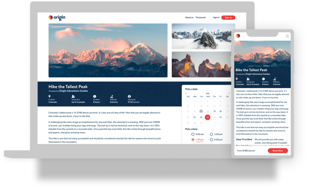
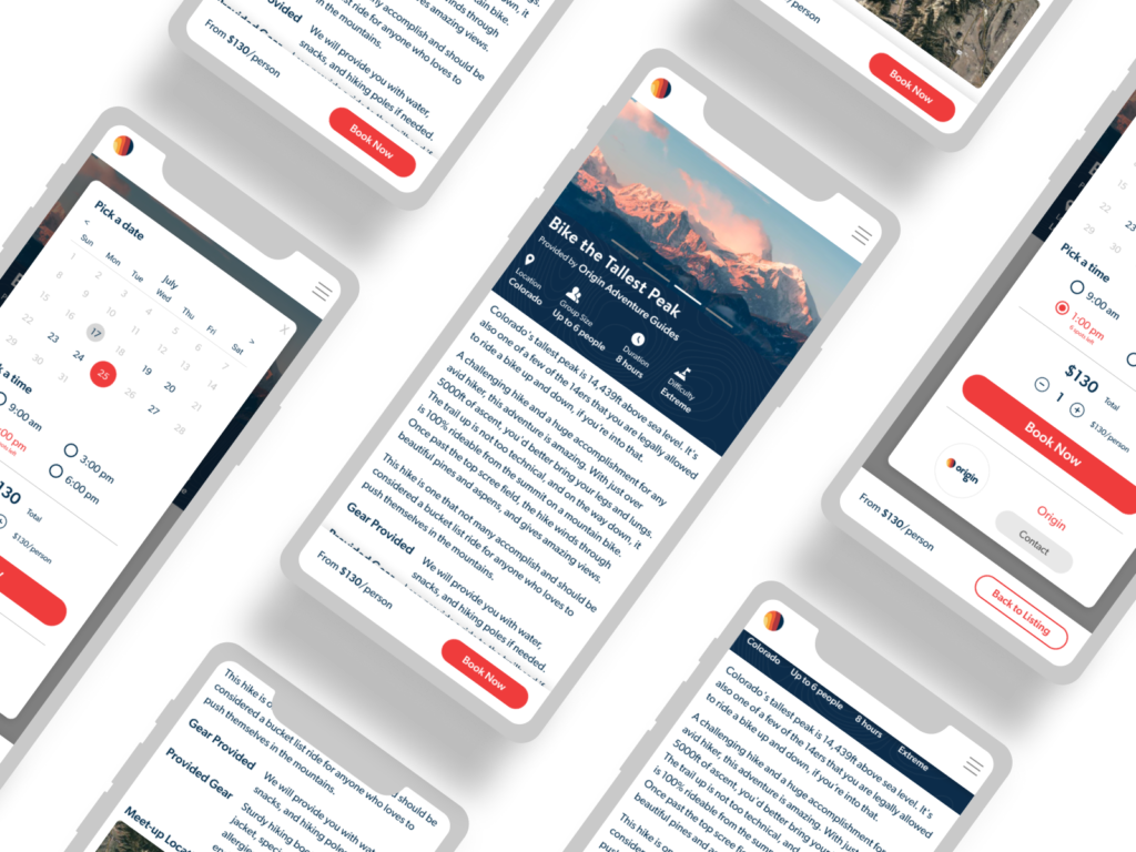
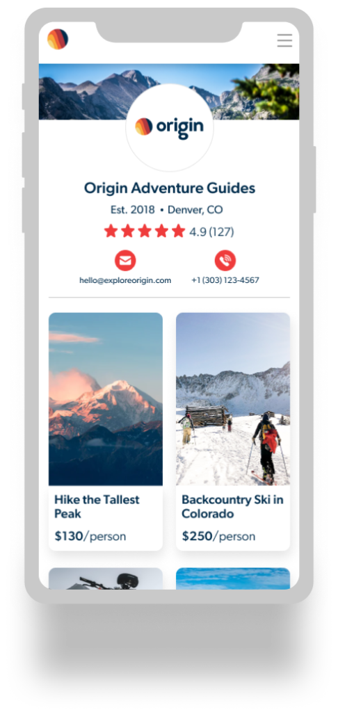
If your tour booking platform is too confusing, customers may leave to find a site that has a simple user interface (UI) instead. Users visiting your website must have a good — if not great, experience. The Nielsen Norman Group defines user experience as “meet(ing) the exact needs of the customer, without fuss or bother. Next comes simplicity and elegance that produce products that are a joy to own, a joy to use.”
What do we mean by “simple user interface”? Take the Interaction Design Foundation’s definition: “Products should consist of such good interactions that users don’t even notice how they got from point A to point B.” They also add, “Designing a user interface that considers the user’s aims, whether vast or few, and offers the simplest means of achieving these goals, is the height of design sophistication.”
In other words, a booking platform should directly lead users from start to finish with the user’s end goal in mind.
Too many tour operators say users aren’t booking them online because it’s “confusing” and “hard to use.” Outfitters are even creating instructions to help with third-party tour booking systems. It shouldn’t be like this.

What Makes a User Interface “Simple”?
A user interface is effective when a user gets from Point A to Point B without them even realizing how they did it.
The UI is clear
The buttons look and act how buttons should. Links, text, and images all have a reason for being there. The website provides essential information. It leaves out anything irrelevant to what the user needs. The user interface is intuitive, clear, and keeps the user focused on their goal: booking your services.
Designers develop UI with the user’s goal in mind
When a user visits your website, they are looking for a guided tour. They are searching for availability, cost, and weighing their options. Adding extraneous and unrelated options create what Don Norman (Nielsen Norman Group) calls the ‘gulf of execution.’
A simpler term is calling it the “goal gap.” When a user comes to your booking platform, they have a goal in mind. If there are too many paths that don’t clearly lead to their goal, you have a big “goal gap.” The fewer steps it takes for your user to reach their goal of booking a tour with you, the smaller your “goal gap.”
A smart user interface design creates a small “goal gap.”
The UI is convenient and stress-free
Have you ever visited a messy website and left to find your answer elsewhere? Your users are doing the same.
When a user interface is simple, it’s convenient to use and stress-free.

Why a User Interface Should be “Simple”
Today, people look for something that’s simple and easy to use. Visitors don’t want a frustrating experience when they are looking for their next adventure. They will go to your competitor instead.
Because users like automation
The Interaction Design Foundation discusses “cognitive effort” and how a user interface should minimize it. People prefer activities or tasks that use a “minimum amount of cognitive effort.” This means users would rather engage with simple instead of demanding tasks.
When activities are simple, they almost feel automatic. This can give the user more confidence because they feel like they have control.
An effective user interface is predictable. This adds to the automatic feeling users are seeking. Predictable UI intuitively prompts users to the next step and communicates information when they need to know it.
Because users have short attention spans
In our era of immediate satisfaction and information, users have short attention spans. People want fast and easy. If your UI is confusing and slow, they will find a tour booking platform that delivers want they want, when they want it.
Short attention spans combined with unlimited options without a clear path to their goal is like hiking in flip-flops. It doesn’t work. Designing a clear path through your online booking software keeps your users’ goals in mind (i.e. finding a tour). It inevitably helps them book the tour they want.

Why is a simplified user interface important to Origin?
Origin has two customers: tour operators and customers signing up for tours. Having UI that’s easy to understand without burdensome tutorials is imperative for our business. We strive to get people outdoors and exploring the wild. By offering online booking software for tour outfitters with a better user interface than other systems, we know we’re delivering quality.
We are design-led
We’ve seen the shortcomings of existing online booking software. Every feature should be purposeful and work together, creating a streamlined and intuitive user experience.
Simple UI helps increase customer engagement and retention
A clean tour booking user interface not only attracts new customers but retains them. This means fewer bounces and higher conversion rates compared to a confusing user interface.
Effective UI design gives new users confidence in your tour operating company. Your booking platform is a direct reflection of your brand. If potential customers face unclear directions, confusing text, and a complicated user interface, they will assume your company is that way as well.
If your UI is simple and provides a clear path to their goal (i.e. booking a tour with you), it engages users and they’ll likely return.
The most important aspect of a good user interface is a competitive advantage. If visitors to your booking platform are pleased to be there, they’ll stay. They’ll likely book a tour with you. If they’re engaged, they won’t have a reason to visit your competitors’ websites. They’ll have confidence in your web-based booking and you’ll keep them as a customer.
We want tour operators to trust in and use our product and we want your customers to come back. It is our responsibility to offer a system that makes tour operators’ lives easier so you can explore the outdoors more instead of fumbling with administrative tasks behind a desk.


